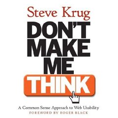
I had heard of this book a few years ago, and have had it on my Amazon wishlist for some time. So when fellow ColdFusion programmer Mike Henke offered me a copy, I quickly accepted. Steve Krug’s Don’t Make Me Think! A Common Sense Approach to Web Usability is a short read, designed to be read in under 4 hours.
My quick take: it definitely deserves the 4.5/5 stars its rated on Amazon.
The first part of the book explains how to eliminate those things in a user interface (on a website) that may cause the user to pause and think for a minute. Things like not clearly labeling the search box, not making links underlined, not making buttons clearly “clickable”, etc. The web has been around long enough that conventions have begun to develop. When a website deviates from this, the user has to spend a few milliseconds (ok, seconds on some sites) figuring it out. All this time adds up, and if it crosses a threshold, the user may just look elsewhere.
I mentioned clearly labeling the search box. Steve recommends that a search box be on nearly every page, and just be labeled “Search”. A little looking around on the web will find some sites label their search box “Find”, “Keywords”, things like that. One thing that confuses me sometimes is sites that put some type of “subscribe” box in the sidebar on every page. This little text box with a small submit button easily passes for a search box when I’m not paying attention, and I often end up subscribing my keywords to a newsletter.
We all know that users don’t really read pages, they skim them. Because of this Steve says we need to be designing billboards, not documents. We need to design our pages to create a visual hierarchy. A newspaper does a great job at this. You can clearly see which headlines, photos, and text are related to each other. Here are the main points I got from the billboards chapter:
- Create a visual hierarchy (think newspaper)
- Things that are related logically should be related visually
- Break the page up into clearly defined areas
- Make it obvious what is clickable
- Keep the “noise” down (there is a chapter on “noise”, or needless words)
Steve makes a point that every page should have a page name, or header or title, whatever you want to call it. Its important to have this title closely (exactly most of the time) coincide with the navigation link that was used to reach this page. One thing I’ll add is that the page name should be reflected in the title tag, too. This way the browser window title in the operating system or the tab tool tip within the browser will reflect the page that the user is on. I run into this a lot in a web based tool I use every day, it doesn’t have the client name in the title and I’m always looking to the window/tab name for some reason to see what client I’m editing – but it doesn’t tell me.
Breadcrumbs a very valuable navigation tool. They make a great accessory, but should never be the primary navigation system. Users often don’t enter a site from the home page anymore, they usually jump in from a google search result or a blog or something. When I’m searching for mittens, and I end up on a page selling red seal skin mittens, its nice to be able to use the breadcrumbs to quickly see where I’m at, and be able to jump up in to the mittens category to see all the available mittens.
Another note about breadcrumbs – they work well at the very top of the page. This way they won’t be confused with anything else, like the page header.
Another one of Steve’s ideas I liked was his list of important questions a site’s “homepage” needs to answer.
- What is this?
- What do they have here?
- What can I do here?
- Why should I be here, and not somewhere else?
I think this is especially important for things like user groups and clubs. Sometimes I come across a user group, club, church, or other local organization website and I have a hard time even tracking down what part of the country they are located in. We need to remember that we are not designing websites for ourselves!
There are really a lot more great ideas I could add here, but I’ll stop now and just say that this book should definitely be in the library of any web developer who works with UI.
The last section of the book covers how to do user testing inexpensively on your own.


Tawanna says:
Great review. I am very much interested in creating the most usable website as possible… some developers I have met could care less. This book seems really interesting. I too had heard of it before and wanted to read it, and now after reading this review I am definitely planning on going out to purchase it.
29 September 2008, 11:30 am